Blok
Rebuilding Sitecore's Design System for Scale, Governance, and AI
Role
Product Designer — Design Systems Lead for Blok
Timeline
April 2025 - December 2025

Executive Summary
Blok is Sitecore's design system: a shared design language that powers consistent experiences across Sitecore's products and marketplace applications.
Although my formal title was Product Designer, I acted as design lead and acting product manager of Blok. I helped lead the initiative to rebuild the design system from the ground up, spanning architecture, design, adoption, documentation, and AI enablement.
What started as a UI library became a foundational platform used by designers, internal and external engineers, product managers, and executives to rapidly prototype, align, and ship ideas, especially within AI-driven workflows.

The Problem
Blok existed, but it was no longer fit for the organisation Sitecore had become.
1. Governance had broken down
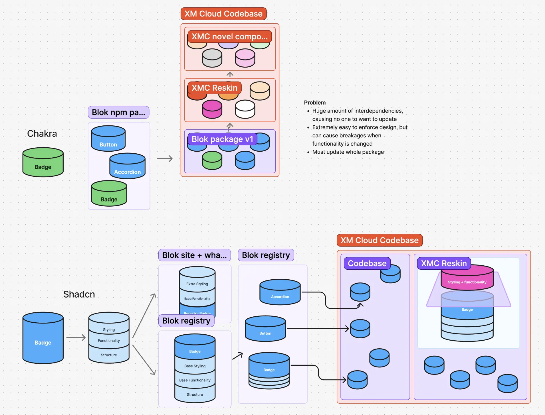
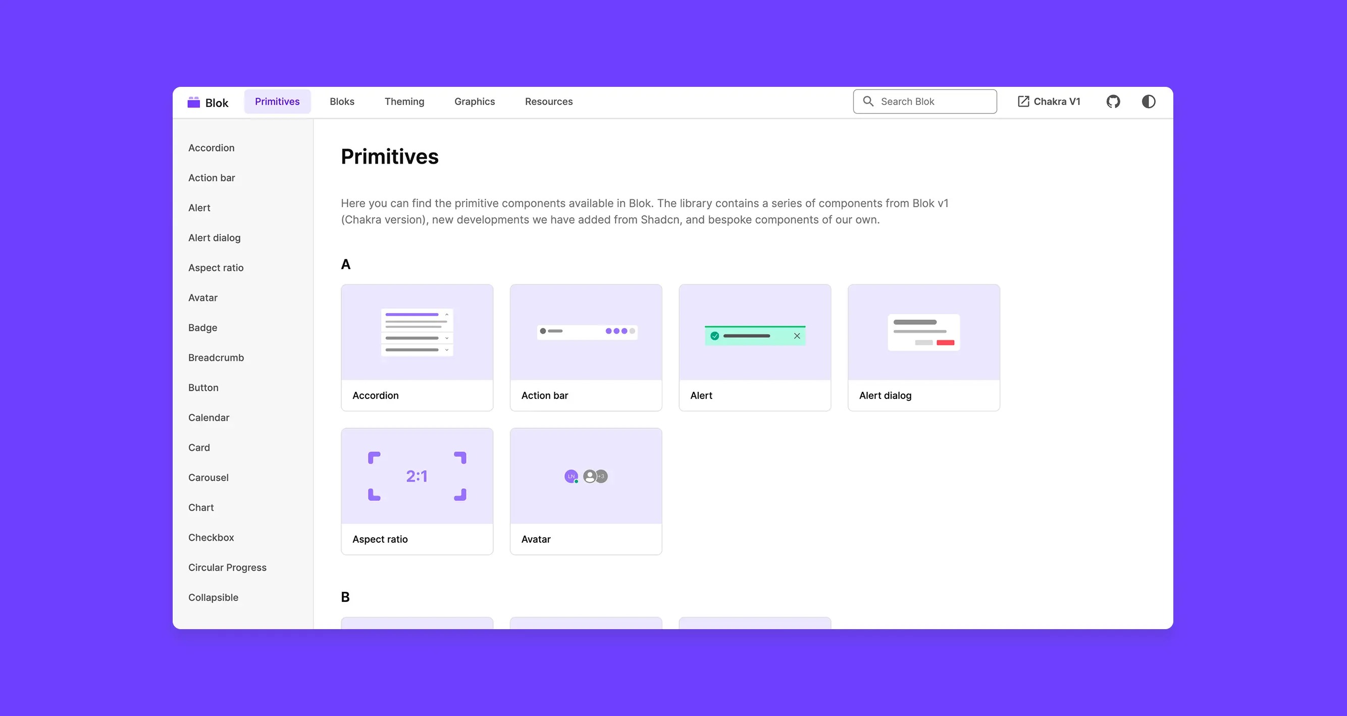
Blok was originally built on Chakra UI v2 back in 2020. While effective for early velocity, it created a structural problem:
- Any deviation in styling of the components out-of-the-box required editing core components
- Editing core components blocked future updates or meant re-implementing the component when updating
- Teams either froze on old versions or forked styles
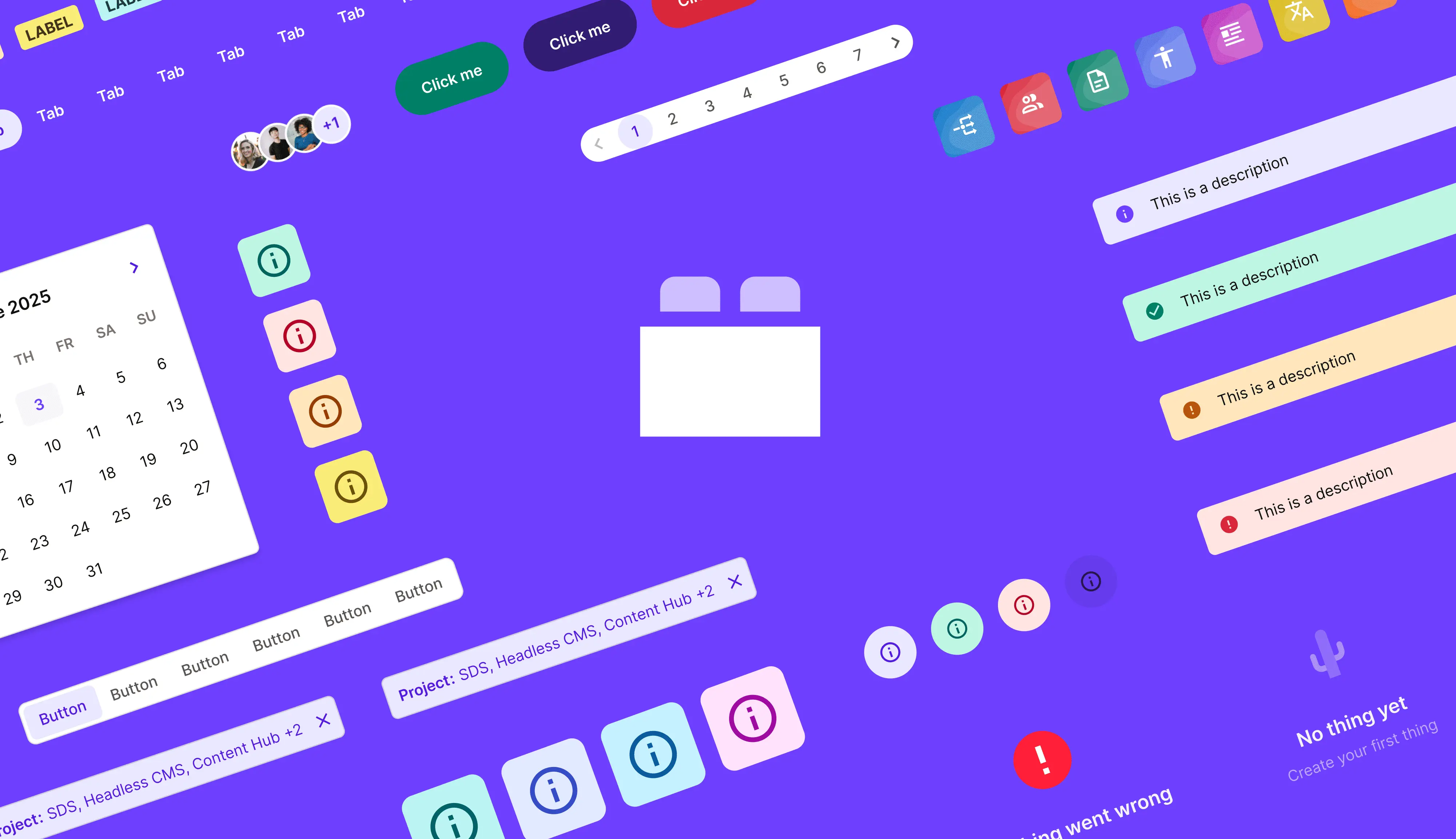
Result: visual drift, fragile upgrades, and no enforceable design governance.
2. The system couldn't support multiple frameworks
With the launch of the Sitecore Marketplace, external teams began building extensions using different React frameworks.
Chakra was:
- Opinionated
- Framework-specific
- Not suitable for external developers we didn't control
We needed a system that could travel across teams without imposing a stack.
3. Blok was not AI-friendly
As AI coding tools (Cursor, Copilot, v0) became central to how teams prototyped, Blok became a bottleneck:
- Heavily customised code
- Minimal inline documentation
- Poor AI comprehension
AI tools struggled to generate on-brand, usable UI, undermining speed and consistency.
The Strategic Decision: Rebuilding on Shadcn
As the sole designer on the initiative, partnered with two senior solutions architects, I helped closedly with the evaluation of alternatives platforms.
We chose to rebuild Blok on Shadcn, not as a UI kit, but as an architecture.
Why Shadcn?
Governance by design
Shadcn's registry-based model allowed us to:
- Publish stable core components individually, instead of in a single package
- Enable extension without modification. Each component could be built on top of without editing the core component
- Update safely without breaking downstream work
This single decision restored long-term governance.
Framework-friendly
A fully framework-agnostic system was explored—but we eventually rejected it due to team size, maintenance overhead, and delivery timelines.
Shadcn struck the right balance:
- Compatible with major React frameworks
- Minimally opinionated foundations (Radix + Tailwind)
- Allowed us to layer Sitecore's design language on top
AI-native by default
Shadcn is:
- Widely documented
- Commonly used in AI training data
- Natively supported by tools like Vercel v0
This made Blok legible to AI, unlocking a new class of on-brand prototyping workflows.
Then... we started building
Migrating components
Moving from Chakra v2 to Shadcn, I audited both, existing Blok components and Shadcn's baseline library:
From this, I:
- Defined what to keep, adapt, or retire
- Prioritised components against active product roadmaps
- Created a tracked component roadmap in Jira
- Authored build guidance for consistency
Development initially became a community effort, with engineers joining from teams already adopting Shadcn and myself having to chase down developers to help review PRs.
Building a better developer experience
After the first wave of components were built by myself and the contributing developers, I:
- Interviewed designers and developers about how they actually used Blok, to inform how we design the site and documentation
- Broke down patterns in how Sitecore designs are made and our components are used into rules that were documented in each component file
- Interviewed developers implemented the new components to find any problems early
Adoption & internal GTM
Blok initially struggled with adoption as it was not majorly publicised or advocated for.
To fix this, I:
- Proactively intercepted new projects and onboarded teams to start using Blok, even at our early stage
- Presented Blok at an R&D town hall (150+ attendees), focussing on getting started and prototyping using AI
- Framed Blok as an acceleration tool, not a design asset
This shifted perception and adoption followed. R&D leadership pushed more projects to use Blok and we started to see more initiatives being built from Blok.
Getting a team
As the initiative grew traction, we were allocated budget to hire a team to get Blok into production for Sitecore Marketplace and continue the initiative to grow its scope.
Once the team was hired, I:
- Helped onboard the team by giving presentations on the history, philosohpy and roadmap of the future of Blok
- Created their first Jira tickets to build guide them on which components and pages of the docs site to build
- Reviewed all of their PRs and provided feedback in grooming calls and sprint planning
After a few months the review feedback became fewer and the team were fully set-up for building out greater projects within Blok

Shipping under constraint
Ahead of Symposium 2025 (where Blok was to be announced as released), the docs site was not ready due to delayed hiring of the team.
I made the decision to release the registry as a Beta, without a docs site, rather than delaying the whole release. My reasoning was:
- Allowing teams to start using Blok both internally and externally enabled us to collect feedback early and iterate on the docs site and registry
- We provided, temporary, in-file documentation so developers could get started implementing without any visuals ready
- During Sitecore Marketplace workshops, we had internal developers helping external devs use Blok, where they were observing any pain points first hand, so we could make changes following this
Post-Symposium, we incorporated feedback and shipped the official release weeks later.
Outcomes & Impact
Organisational impact
Blok is now the default UI foundation for Sitecore Marketplace apps
3 teams fully migrated; all others have Blok on their 2026 roadmap
Blok is used across design, engineering, product, and executive prototyping
AI-SDLC validation
During an internal AI-SDLC workshop, I enabled every participant to prototype using Blok. The resulting demos:
Looked cohesive
Were on-brand
Required minimal design input
These were presented to the CPO and CTO, who explicitly praised the quality and refinement enabled by Blok.
Reflection & Learning
What I would change
We initially over-customised components to preserve legacy visual behaviour from the Chakra v2 version of Blok. This came at a cost:
- We overwrote parts of Radix's native structure
- AI tools performed worse as a result
In hindsight, we should have accepted more behavioural change in favour of AI and architectural alignment.
What this taught me
This was my first zero-to-one platform initiative with as a solo-designer and acting product manager. I got to get get hands-on with all aspects of the initiative:
- Roadmap ownership
- Executive visibility
- Cross-org dependency management
I learned how to:
- Balance design purity with system leverage
- Drive adoption through narrative, not mandate
- Operate comfortably between designer, PM, and technical partner roles
Blok fundamentally changed how Sitecore builds, prototypes, and aligns, and reshaped how I think about design systems as organisational infrastructure, not UI libraries.


